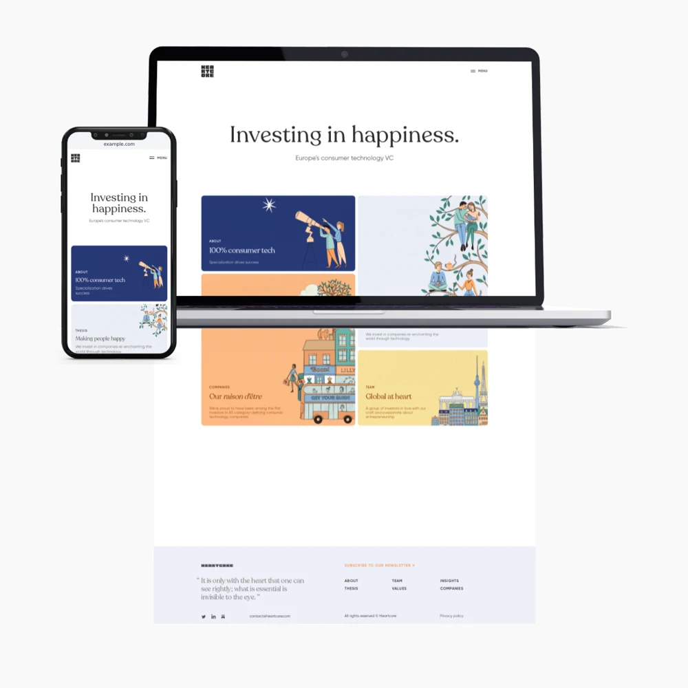
Take a mobile website screenshot
See your website at a phone-sized viewport without photographing a screen. Snap captures mobile and desktop versions together, ready to download or place in a device mockup.
Free to use. No account or watermark.
Show the mobile and desktop versions together
Responsive websites change their navigation, text and images to fit smaller screens. A mobile website screenshot makes those differences visible. Use it alongside the desktop capture when presenting a redesign, updating a portfolio or discussing a layout with a client.
Choose a phone frame or download the original
Paste a public website URL into Snap. Once both captures are ready, filter the layouts to find mobile views or an iPhone mockup. Choose a background and download a PNG. To save the page without a device frame, open the download menu and select Original mobile.
A screenshot isn’t a device test
Snap renders the page in a browser at a mobile viewport. An iPhone frame is a presentation layout, not proof that the site works in Safari on a physical iPhone. Check navigation, forms and touch controls on real devices when testing your website.
Use your own screenshots for private pages
Snap can’t open pages behind your login or use a session from your phone. Capture those pages yourself and upload the images instead. Downloads are free and have no watermark. Files are removed after seven days, so save your finished images.